In this final part of the tutorial, you will create a title treatment and type that will add to the emotion and be integrated with the overall illustration. A spread such as this, indeed any ad or page layout, will have more impact and hold together better if the type interacts in some way with the other elements in the composition and is treated in a way that contributes to the emotional thrust of the story, rather than just sitting on top of the illustration like an afterthought.
CREATE THE TITLE TREATMENT
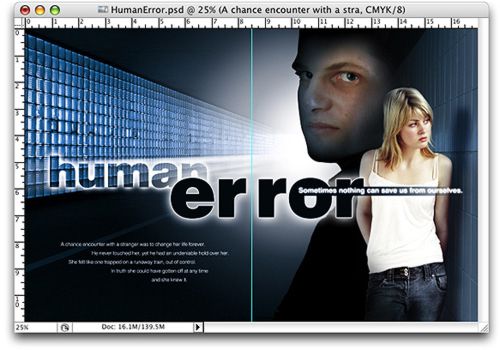
The title will be large, becoming an important design element in itself that helps unite the two pages of the spread. In a two-page spread, the center seam is called the gutter, and for the type to be legible you need to add space between the letters that actually cross the gutter. This is always tricky. You need to add enough so the letters don¡¯t get lost in the fold, but not so much that the word falls apart and doesn¡¯t read immediately. Refer to the publication specifications (usually available in the online media kit from the publications website) or contact your sales rep at the publication for specific recommendations on how much room you need to allow.
 First, establish the center of the spread.
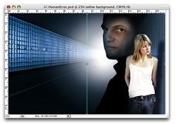
You need to use a layer that is exactly the same size as the image window. The original background layer will do the trick. Double-click on it to rename it and turn it into a regular layer. Any name will do, I just used white background. Now, check Show Transform Controls in the options bar. In addition to showing handles on the bounding box, a center point will appear. Turn the rulers on (Command-R/Ctrl-R). Click the vertical ruler on the left and drag a guide to the center of the image window using the center point as a reference. Uncheck Show Transform Controls.
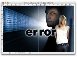
Next, set the type for the word ¡В°error.¡Вұ Choose a font that is bold and easy to read. You want the title to pack a strong graphic punch. I chose a font called Swiss 721 and Black as the font style, but you could use Arial Black, or any strong sans serif font that has a style (weight) of black.
| STEP 1 |
|
| Make a new group at the top of the layer stack named TYPE. |
|
|
| STEP 2 |
|
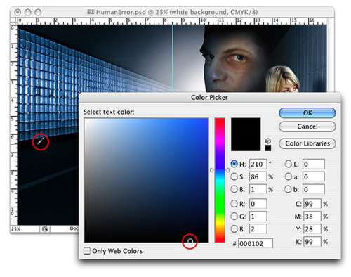
| Select the Horizontal Type tool. In the options bar select the font family, font style, and point size (for ¡В°error¡Вұ I used 192.5). Click the color swatch in the options bar to set the text color. This will bring up the Color Picker. With the Color Picker active, move your cursor over one of the darkest areas of the composite and click. Selecting a color from within the composite will insure that the color of the type will harmonize with the overall color of the composite. Click OK. |
| STEP 3 |
|
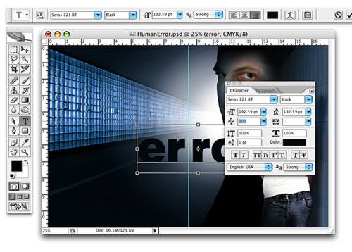
| Type the word ¡В°error¡Вұ and position it approximately as shown. The center of the page should fall right between the two ¡В°r¡¯s.¡Вұ |
|
|
| STEP 4 |
|
| Open the Characters palette by clicking the Toggle the Character and Paragraphs palettes button in the options bar. With the Type tool still selected, click between the two ¡В°r¡¯s.¡Вұ In the kerning field of the Characters palette enter 100Click the check mark in the options bar. |
| STEP 5 |
|
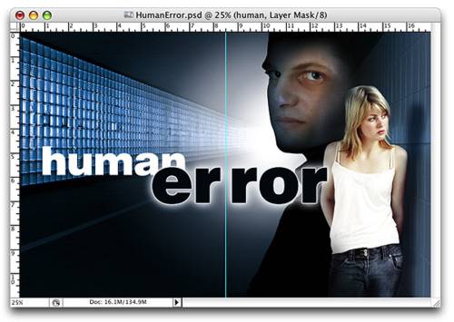
| Now to make the type appear to be backlit, from the Layers Styles menu at the bottom of the Layers palette choose Stroke. Make the stroke 6 pixels. Click the color swatch and choose a light blue-gray color from within the image for the color the stroke (my stroke is C-6, M-2, Y-2, K-5). Before closing the Styles dialog, double-click Outer Glow from the menu on the left and in the Outer Glow Structure pane enter 68% for the opacity. In the Elements pane enter 1% for Spread. 65% for Size. Leave the parameters in the Quality pane at the default settings Click OK and save your document. |
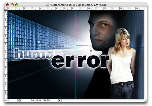
 It¡¯s time to finesse the composition. I think Jill needs to be closer to Jeff. This will tighten up the composition and imply a greater intimacy between the two. As you move her closer, watch where the final ¡В°r¡Вұ in error overlaps her body. The position of error horizontally is pretty much fixed because of the gutter. So, Jill is the element that we have to move to get the overlap right. Select the Move tool, highlight the group JILL and move the group to the left slightly. Some things to watch for when overlapping type in this way are uncomfortable tangents or having the type cross the body at an uncomfortable location, across the person¡¯s throat or crotch for example.
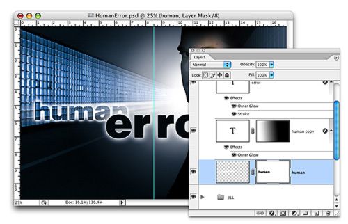
To give the type a sense of depth, as if it exists within the same three-dimensional environment as Jeff and Jill, the word human will be a little smaller. It will be treated differently from error for contrast and to add to the sense of speed and uncertainty. Making the type transparent will add further to that sense of uncertainty and more fully integrate the type with the background.
|
|
| STEP 1 |
|
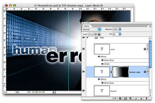
| Highlight and open the group TYPE. Select the Type tool again. Choose the same font and style as before. The point size smaller than that used for error (I used 119.4). Make the color white. Type ¡В°human¡Вұ. Change to the Move tool. Place the new layer below the layer error in the Layers palette and position the type in the image window approximately as shown. The trick here is to position human so it is overlapped by error in such a way that we achieve the layered effect we are after while preserving the legibility of the word human. |
| STEP 2 |
|
| Duplicate the layer human and hide the original layer momentarily. With human copy highlighted, choose Outer Glow from the Layer Styles menu at the bottom of the Layers palette. You can leave the Blend Mode on Screen. Set the Opacity to 100%. In the Elements pane, set the Spread to 8% and the Size to 40%. Click OK. Reduce the layer Fill to 0%. Fill is located at the top of the Layers palette just below Opacity. This will cause the white type to disappear while preserving the outer glow style. |
|
|
| STEP 3 |
|
| Add a Layer mask to human. Make your foreground color black and, using the Gradient tool set to Linear Gradient and Foreground to Transparent, reduce the opacity of the right side of human giving it the appearance of starting to fade into the light. |
To heighten the tension and reinforce the concept of being on a train out of control, we will add some streaks from human going back in perspective to the entrance of the subway.
| STEP 1 |
|
| Show the original layer human. Make sure the Fill is at 100%. Rasterize the layer by going to Layer>Rasterize>Type. |
|
|
| STEP 2 |
|
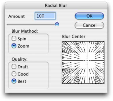
| Go to Filter>Blur>Radial Blur. In the Radial Blur dialog increase the Amount to 100, for Blur Method choose Zoom, and for Quality choose Best. This filter produces some cool effects, but the dialog is not as accurate as I would like when it comes to defining the Blur Center. You need to click in the Blur Center window and drag the point of origin to define where the blur is coming from. Try to place the point of origin approximately over the entrance to the subway. I know, it¡¯s real guesswork, but don¡¯t worry about it too much. The next step is where we will really achieve the result we¡¯re after. |
|
|
| STEP 3 |
|
| Press Command-T/Ctrl-T to activate the Free Transform command. Hold down the Command/Ctrl key and drag the middle handle on the right side of the bounding box toward the entrance of the subway. Still holding the Command/Ctrl key drag the upper right corner handle up a little. The idea is to create streaks of light going back in perspective. |
|
|
| STEP 4 |
|
| Without switching layers, Command/Ctrl-Click on human copy to load the type as a selection, then Option/Alt-Click on the Add layer mask button at the bottom of the Layers palette to add a hide selection layer mask. This will hide (knock-out) the area of the letters making the word clearly legible. |
SET THE SUBTITLE AND BODY COP
| STEP 1 |
|
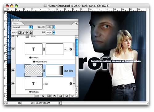
| Highlight the layer error. Select the Horizontal Type tool. For the subtitle I used the same font as the title, but I chose Bold from the Style menu rather than Black. I used a point size of 19.5 and the color white. Type ¡В°Sometimes nothing can save us from ourselves.¡Вұ Position the line of text so it begins just inside the ¡В°o¡Вұ of the word error. |
| STEP 2 |
|
| From the Layer Styles select Outer Glow. Leave the Blend Mode on Screen. Make the Opacity 75%. In the Elements pane enter 4% for Spread and 9 pixels for Size. Press OK. |
| STEP 3 |
|
| Make a new layer below the subtitle layer and name it dark band. With the Rectangular Marquee tool, define a long narrow box around the line of text. Use the Eyedropper tool to sample the color of error and fill the box with that color. Deselect(Command-D/Ctrl-d). |
|
|
| STEP 4 |
|
| If necessary, reposition the box so the text line is centered top to bottom. Add a layer mask to dark band and using a brush or the Gradient tool gradually reduce the opacity of the right side of the band. |
|
|
| STEP 5 |
|
| For the body copy (the small copy on the left page), select the Type tool and choose the same font you have used for the title and subtitle, but choose Roman or Medium from the style menu. If that style is not available, you may need to choose a different font. Click the Left Align Text button and choose white for the color. Click and drag with the Type tool to define a text box, then type ¡В°A chance encounter with a stranger was to change her life forever. He never touched her, yet he had an undeniable hold over her. She felt like one trapped on a runaway train, out of control. In truth she could have gotten off at any time and she knew it.¡Вұ I broke the lines after each sentence with the exception of the last sentence, which I broke after ¡В°time.¡Вұ Use the Spacebar to add space before each line to create a random staggered look. Use the Move tool to position the text so it fits comfortably in the lower left quadrant not too close to the gutter. |


 Using Color and Light to