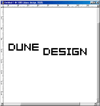
 Start with a 800 by 600 file in RGB mode and keep the background white for now. Type your text on a new layer, using a pixelfont such as 04b_08 or swfit_slm_fw and a 60 pt size or up. Make it black.
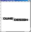
Add a stroke by selecting Blending Options and choosing the stroke tab. Make it a 1 pixel white stroke on the outside. Next, add a dropshadow. Make it black, 100% opacity, multiply. Set all the other values, including the angle, to 0. Except for the size, make that 9.
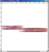
 Duplicate your type layer, and rasterize the bottom layer (the original text layer). Now go to Blur, Motion Blur and set it to angle 0, distance 90.
On this blurred layer, go to Edit - Transform - Scale and pull the right and left side of your image to the far end op your document. The top and bottom should be pulled out just a little.
 Now, set the top text layer, the one that's still intact, to Difference. You're done the basic effect, but of course there's many things you can still change. Try different Blend Modes for example, to see what they will do. Duplicate some of the layers and mix them up.
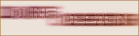
Lastly, you need to play around with the colours. You may play around with the colour balance, the hue and saturation or you can add a colour layer. Weprefer adding Colour Balance adjustment layer to the whole, so we can always undo it. Add several to get multiple colours into your image instead of just one colour in several hues. If you want, crop part of your image. This is what we came up with.