Freeform Interface Walkthrough
[ 作者来源:Tutorials/purephotoshop
编辑整理:
PhotoShop资源网
更新时间: 2006-07-18
录入: 黄叶飞扬 ]
Considering I can't draw a stick man, I usually start off with an array of shapes kinda puzzled together, I sometimes create these in
Illustrator because
Illustrator makes this process alot easier. If you have the luxury of illustrator, you can drag your shapes right into photoshop. Also, If you want to make a custom shape from what you've drawn in
Illustrator, Hold ctrl and drag the shape into
Photoshop. Once the shape appears, go to Edit>Define Custom Shape.
I keep these shapes on seperate layers, this allows for more control and customization possibilities.
At this stage, I start to add some highlights on different parts of my interface, but i'm not paying to much attention to detail at the moment, just trying to render the basic shapes. I'm using the dodge tool to do this set to different modes and opacities. I also added a bit of dropshadow the left most peice.
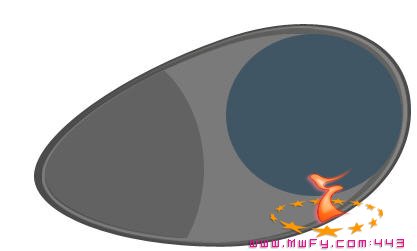
Now, I start going around the edges adding shadows where I feel they need to be, My light is coming from the top left , almost above my interface. This is important, you want to make sure you have your light direction in mind when rendering your shapes. If you have light coming from the top left, your darkest shadows will be on the bottom right. Now the shadows will spread of course, but I hope you understand.
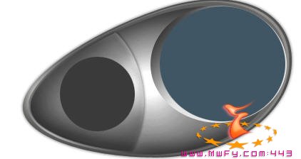
Now I added some more shapes, and i'm starting to fill out my interface more. I added a rather large inset for the main display and I also created the basic shape for where my control buttons will be.
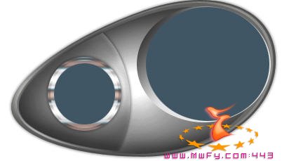
I then added some real sharp and vibran chrome dressing around where my buttons will be. Mark has an excellent tutorial on how to achieve this look over at Photoshop Gurus. His look is actually alot better than mine, heh, so hop over there and check it out.
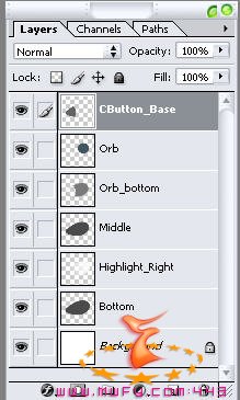
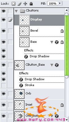
Here is another look at part of my Layers stack.
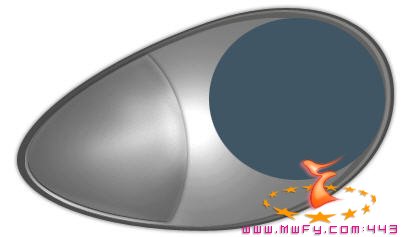
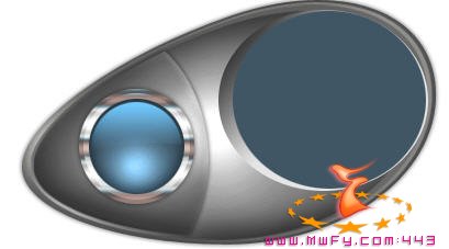
Now I start bringing in some details to my Control Buttons. I'm using my Airbrush tool set to linear dodge mode and a light blueish color to bring out some glow in my button orb. I also used my pen tool to create a gloss shape up at the top of the cbuttons. Note that I did not use white for highlights. When doing displays and orbs, etc, a highlight is semi transparent, and will therefore not be solid white at any point. I've found it alot better to use bright colors that correspond with my base color.
I then started to do the same thing with my main display. Keeping in mind the direction of the light for my main highlights.
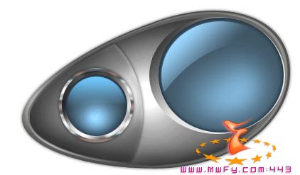
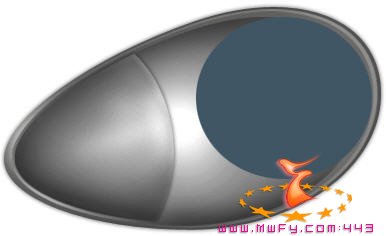
During this phase i'm starting to add more details, more highlights and shadows to my main interface parts. I also added some more details to my main display, and for a touch of something different, I faded in some white lines to my main display.
I'm also adding my cbutton glyphs (Play, Next, Back). I'm using my Type on path tool that comes as a feature of the new Photoshop CS. If you don't have this luxury, you can try your text warp settings, and also you can try to rasterize your layer and use the liquify filter very suttle.
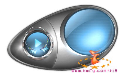
Now, I'm focusing on some of the smaller details. In this step I'm using lines and circles to seperate my buttons. All I'm doing here, is using my pen tool and I have it set to 'paths'. Then when I draw the line, I stroke the path with a 1 pixel brush. You can also use your line tool if you would like.
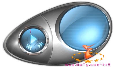
Now I added more details and also I added a volume slider using my rounded rectangle tool, and I free transformed it into place. I also added more highlights to my cbuttons. Now, if you look around the main display you will see some metric type lines. I used Illustrator to create this. In illustrator I created a pattern brush of 3 vertical lines and then used it to stroke a circle, then draged it into Photoshop and sized it up. I also added some dummy text just to see where I want to fit everything in on my display.

Now to finish up, I created a balance tuner and also an inset for it in much the same manner as the main display and cbuttons. I also wasn't satisfied with the round shape of the volume slider button, So I created a rounded rectangle and free transformed it into place.
As you can see, I also added more text and a few last minute touch ups to the main display. If you'll notice the half circle of squares in the main display. I created this in Illustrator as well, using the same methods as I did before with the metric type circle. I then added a mask to this layer and masked out the top half of the circle.
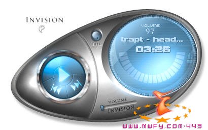
Well, thats about it. You can continue to build on your skin and add alot more features and details. This is just the way I create alot of my skins (which I never seem to get any coded ). If you have any question, come on over to Our Support Forums. Enjoy!